How to Choose Mehndi for Your Hand Shape and Finger Length
The same mehndi reference can look different on every hand. Learn how motif scale, direction, spacing and finger detail can work with your natural proportions.
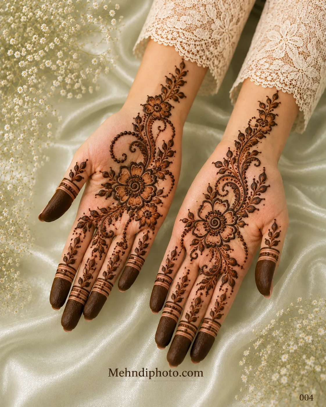
A mehndi design is not a sticker. The artist adapts it to a moving, three-dimensional hand, which is why the same reference can feel airy on one person and crowded on another. You do not need to follow rigid “rules” for hand shape, but understanding proportion makes it easier to choose references that translate well.
Start with motif scale
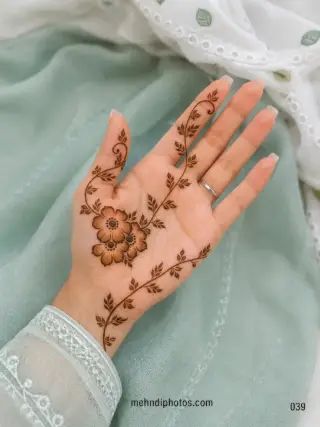
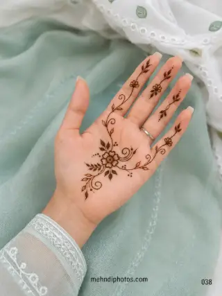
On a smaller palm, one medium flower or mandala often reads more clearly than several tiny focal motifs. A larger palm can comfortably carry a broader centre, layered paisleys or multiple sections. The goal is not to make the hand look bigger or smaller; it is to keep the design readable.
Use direction to organise the hand
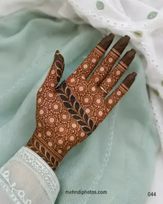
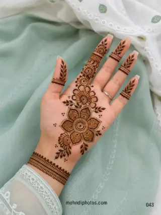
Vertical vines and diagonal Arabic trails naturally lead the eye along the hand. A round Gol Tikki creates a clear centre, while a diagonal composition can connect the wrist and fingers without filling the whole palm. Compare both before deciding which structure feels more like you.
Think about finger length separately
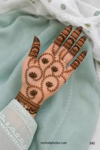
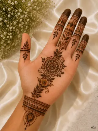
Long fingers can carry stacked bands, jaali sections and repeated motifs without becoming visually compressed. Shorter fingers often look cleaner when the pattern uses fewer bands with slightly more space between them. Finger-only references in our Finger Mehndi collection are useful for comparing these proportions.
Small hands do not require tiny details
This is a common mistake. Very fine motifs can merge together once the stain develops. A smaller hand may actually benefit from fewer, slightly bolder elements. Open skin around those elements helps each one remain visible.
Wider palms can support a strong centre
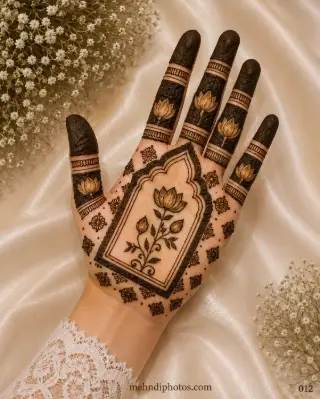
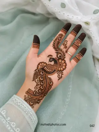
A lotus, mandala, peacock or floral cluster can anchor a wider palm beautifully. If the centre is detailed, keep the surrounding filler calmer. A strong focal point usually looks more intentional than covering every centimetre with equal detail.
Match front and back without copying them
Your front hand and back hand do different visual jobs. The palm can hold a central composition; the back often works well with diagonal trails, jewellery-style chains and negative space. They can share flowers, line weight or wrist borders without being identical.
Try the screenshot test
Before choosing a design, look at the reference at normal phone size instead of zooming into every line. Can you still see the main structure? If the design only looks impressive at extreme zoom, it may become a dark texture from normal viewing distance.
Choose comfort over rules
Hand-shape advice should help you edit a reference, not tell you what you are allowed to wear. If you love a dense design, wear it. If you prefer one tiny flower, that is equally valid. Use proportion to make your preferred style clearer, not to replace your taste.